Just a quick post and tutorial for my latest design project!
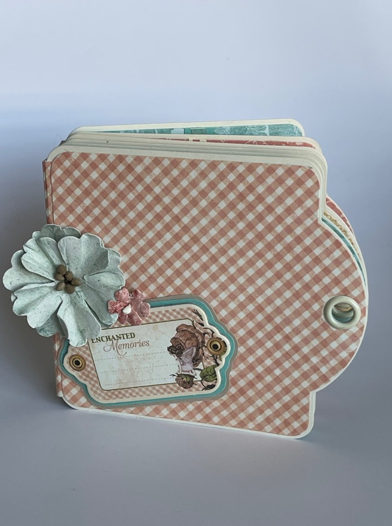
For this project, I used a Graphic 45 Square Ivory Tag Album.
In the tutorial, I show you how to put the album together and provide design inspiration. No dialog in the tutorial, just written instruction prompts and lots of photos to help you follow along as you create your tag mini album.
So happy to bring you my first design project for 2021!
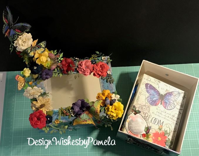
For this project, I used the gorgeous paper collection and sticker set “Lost in Paradise” from Graphic 45.
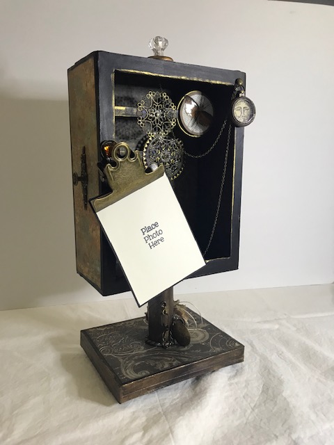
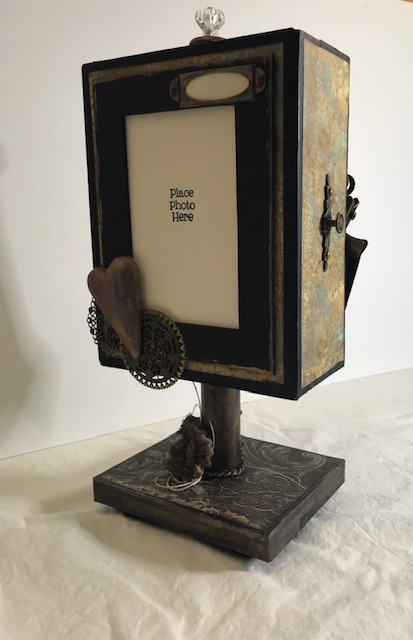
Some design elements include an inlay center piece in the front of the box, unique box opening, hinge closure, large photo display for photos, and metal “rivot” heads on hinges.
This uniquely designed boxed album set makes an attractive display for your album collection or photo library.
You can see a list of some of the primary products I used for this project design in the YouTube description box and below.
Thank you so much for stopping by. I hope you are inspired to created your own boxed mini album.
List of some of the products I used in this project.
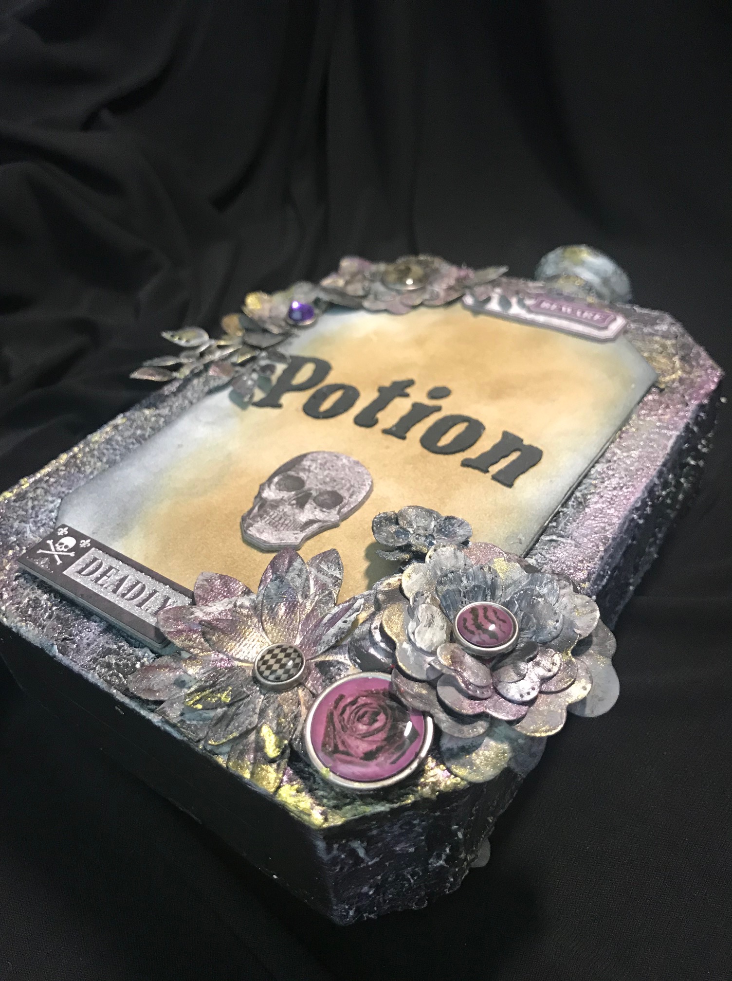
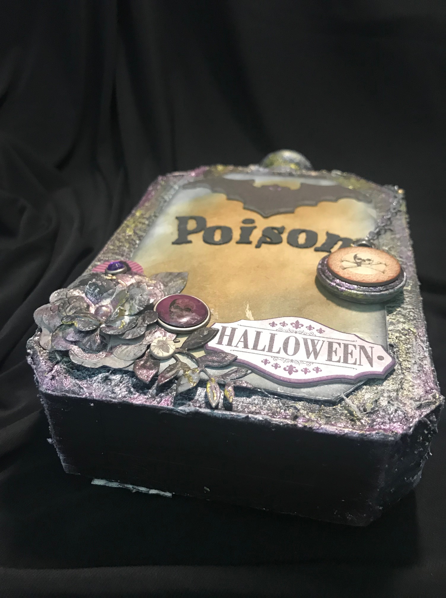
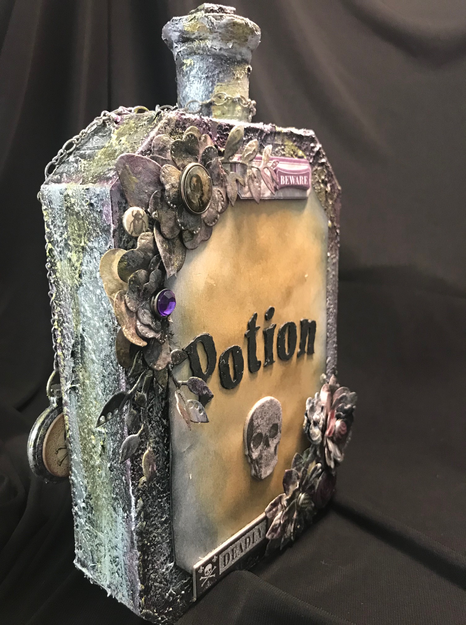
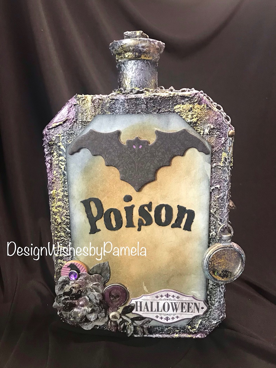
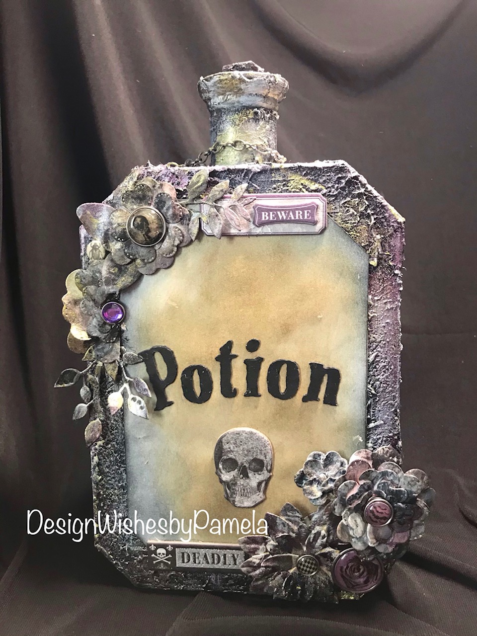
Today, I am sharing the final project for the series. I just had a few bits of flowers leftover from the original project, and decided to design something for Halloween.
If you are just viewing the series post, here is what the original project looked like. I took it completely a part (excluding the album), and created new project designs.
Here are the two previous projects I designed from using parts of the project above.
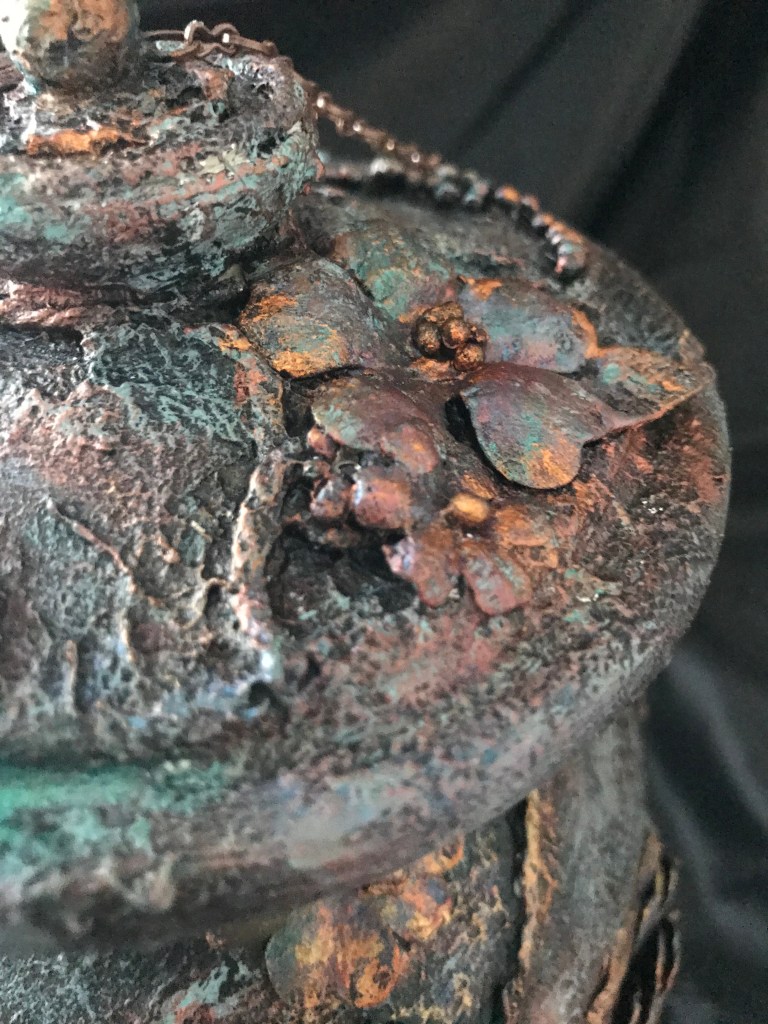
For this last project, I used chipboard to create the potion bottle. I also used a cardboard tube from a plastic bag roll, a wooden foot base from my mixed media supplies, and topped the bottle off with a stack of 1/2″ chipboard squares. The texture for the bottle was created using Liquitex Gesso and Blended Fibers Paste. The colors on the bottle was done with a layering of Liquitex Mars Black Acrylic Paint, Prima Marketing Inc/Finnabair/Art Alchemy Sparks Paint in Fairy Wings and Iris Potion along with Silver Spoon Metallique Acrylic Paint. I used a touch of White Satin Acrylic Paint from Craftsmart (purchased from Michael’s). The flowers were originally created by using the flower and leaves die from Graphic 45 Large Tag, ATC Tag & Flower Metal Dies set. I colored with a combination of Ranger Ink/Tim Holtz Distress Inks in Black Soot, Walnut Stain, Scattered Straw, and Vintage Photo. I also used Liquitex Gesso for base coating the flowers and the Mars Black Acrylic Paint. The chain was distressed with the same combination of paints and acrylics as mentioned before.
Additional accents for the bottle include chipboard and brad pieces from Recollections (Michael’s brand) and “Wicked Mechant Malvado” from My Mind’s Eye. I used a Mini Pocket Watch from Time Holtz Idea-olgy. For the Poison and Potion titles on the bottle, I used PN Goose Pimples font from Silhouette and cut the letters out on my Cameo 3 with Recollections black cardstock. I triple layered the letters to give a raised effect. I created the label bases by cutting cardstock in layering the cut pieces three times. I distressed the labels with Ranger Ink/Tim Holtz Distress Ink in Black Soot and Vintage Photo.
Here is a video showing the entire project process design.
I hope you enjoyed this series. Please follow me on social media, my blog, shop, and YouTube Channel. You can use this one link to access my posts. https://linktr.ee/designwishesbypamela
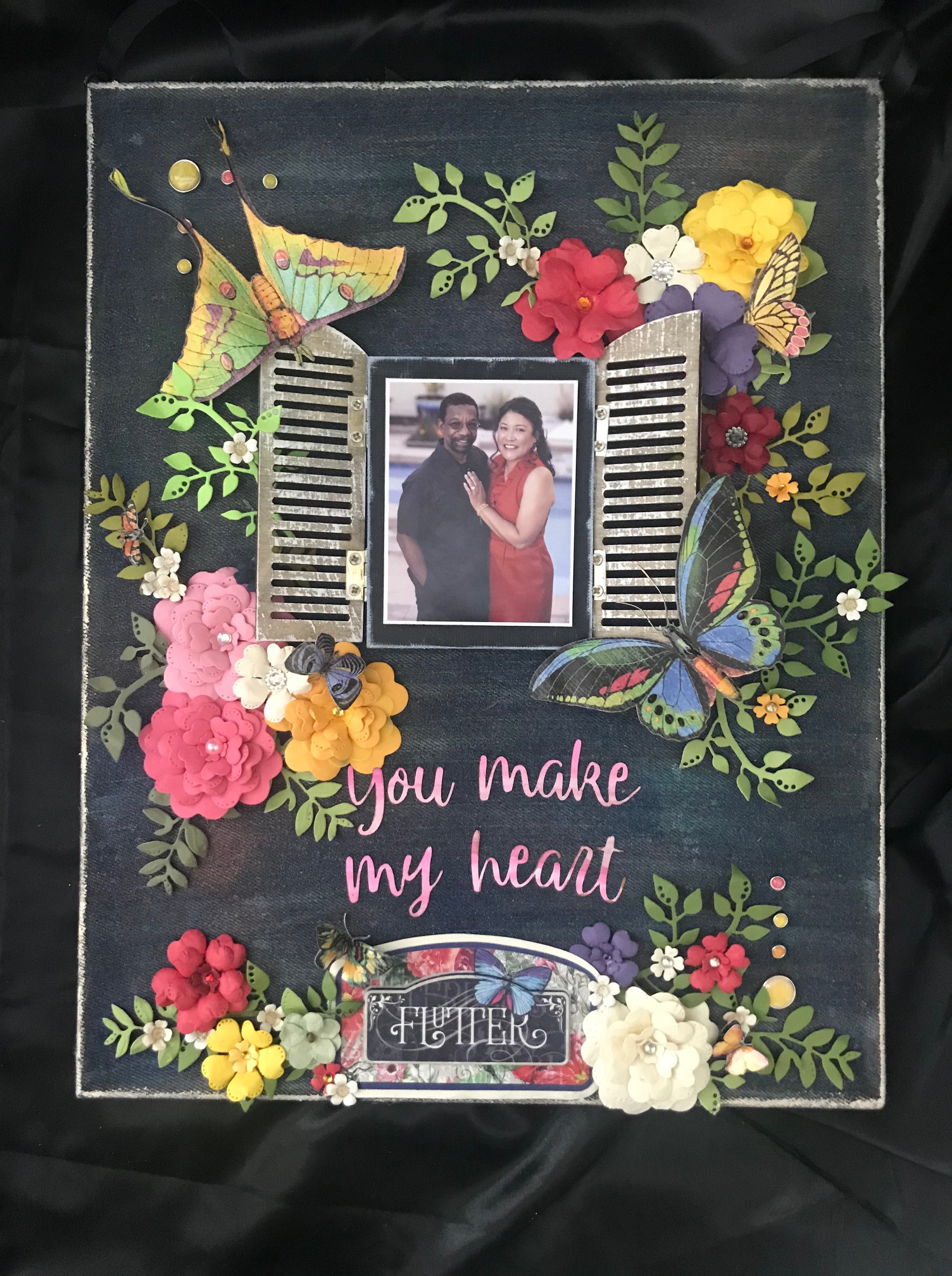
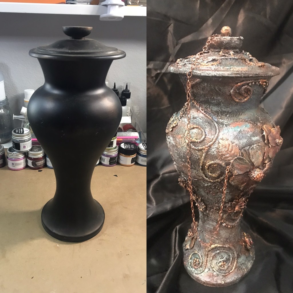
For this project, I take an inexpensive thrifted vase and redesign it for a new home decor item!
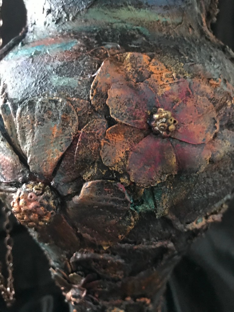
I use a variety of Finnabair/Prima Marketing Inc. Wax Cire Cera colors to create a “metal-like” effect. I also use Finnabair Art Basics Soft Gloss Gel and Heavy Gesso,and Art Ingredients Art Stones. In addition, I use Liquitex Gesso, Blended Fibers, and Light Modeling Paste to create texture and adhere the floral and cord details.
I love the transformation from something simple to something with design and flare!