Mini Wood Palette Father’s Day Gift Idea

Need a quick and clever gift for Father’s Day?

I designed and created this desk caddy using mini wood palettes I purchased from my local Dollar Tree Store!

Check out my YouTube video on how I put together these cute little caddies. I give you the measurements and supplies I used to create each of these caddies. The pocket feature will fit a gift card too!

I hope you enjoy this project.

Thanks so much for watching.


Tim Holtz Configurations Redesign Project

Really happy to share with you a new redesign project today!

I used a 5.75″ X 10.75″ Tim Holtz Configurations set as the base for the project. More about of some of the products I used to create the redesign is included in this post.

I wanted the back and front of the configuration frame to be the same depth. In order to achieve this I rebuilt the original tray from the configurations set to make the “lid”.

I used hardware pieces from my mixed media collection and Tim Holtz Idea-ology Foundations Box Feet. I painted all of the metal hardware in Prima Marketing / Finnabair Art Alchemy Sparks Paint in Ginger Magic. I also used the Sparks paint for detailing the edges of the drawers and box.

To give each drawer a little pizzazz, I used a Stampers Anonymous Tim Holtz Collection Stencil “Crackle” on the sides of the drawers and outsides of the box. I first put a layer of Sparks paint, then used Prima Marketing / Finnabair Art Alchemy Metallique Acrylic Paint in Deep Waters and Emerald Green, alternating between the colors on each drawer. To finish off the drawers, I used a mixed selection of ceramic and glass beads from my jewelry making supplies. I attached the beads using eye pins and Glossy Accents. For more just a little more pizzazz and bling, I added Swarovski crystal gems to cover the bead holes and eye pin heads.

I used my technique for creating chipboard projects (see my YouTube channel videos for how-to), I then applied a base coat to the entire piece, including the drawers, in Prima Marketing Inc / Finnabair Art Basics Heavy Black Gesso. This gave me the full cover base I needed to apply the color to the project. I used the Crackle stencil and some Liquitex Blended Fibers to create the texture on the box.

Once everything dry, I gave it 24 hours before I starting painting, I used a combination of Craftsmart Multi-Surface Premium Chalky Acrylic Paint in French Teal, Art-C Ultra Chalk Soft Matte Paint in Turquoise Blue and Art-C Metallic Paint in Eggplant, and Art Alchemy Metallique paint in Emerald Green and Deep Waters. I used Sparks paint for bits of highlighting over the entire box base. For the drawer fronts, I used a painting technique I learned many years ago. I floated three of the paint colors on my paint brush, then brushed over the drawer fronts giving them a blended paint look. The last step was spraying the entire project with Krylon Matte UV-Resistant Clear Acrylic Coating. I left the clear window that came with the Configurations box off to avoid getting overspray on it from the acrylic coating. I later attached the clear window using double-sided tape.

FINISHING TOUCHES:

For staging and accessorizing the project, I used pieces from my mixed media collection (magnifying glass and keys). I also used rhinestone pieces from Mon Ami Gabby (flower pin, Cinderella Coach, round buckle), and a Tim Holtz Assemblage Locket. The inside back panel was created by using a piece from 7gypies Architextures Junque Attic Collection. Pearl accents are from Tim Holtz Idea-ology Baubles Collection.

I hope to bring you a new design project soon!

Thank you for following this blog, and for following me on social media.


Halloween Decor – Potion Bottles

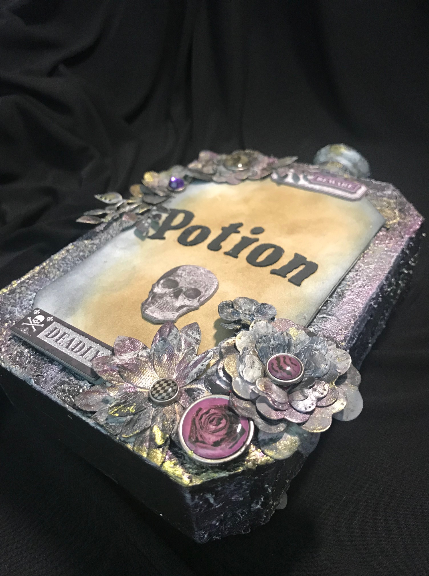
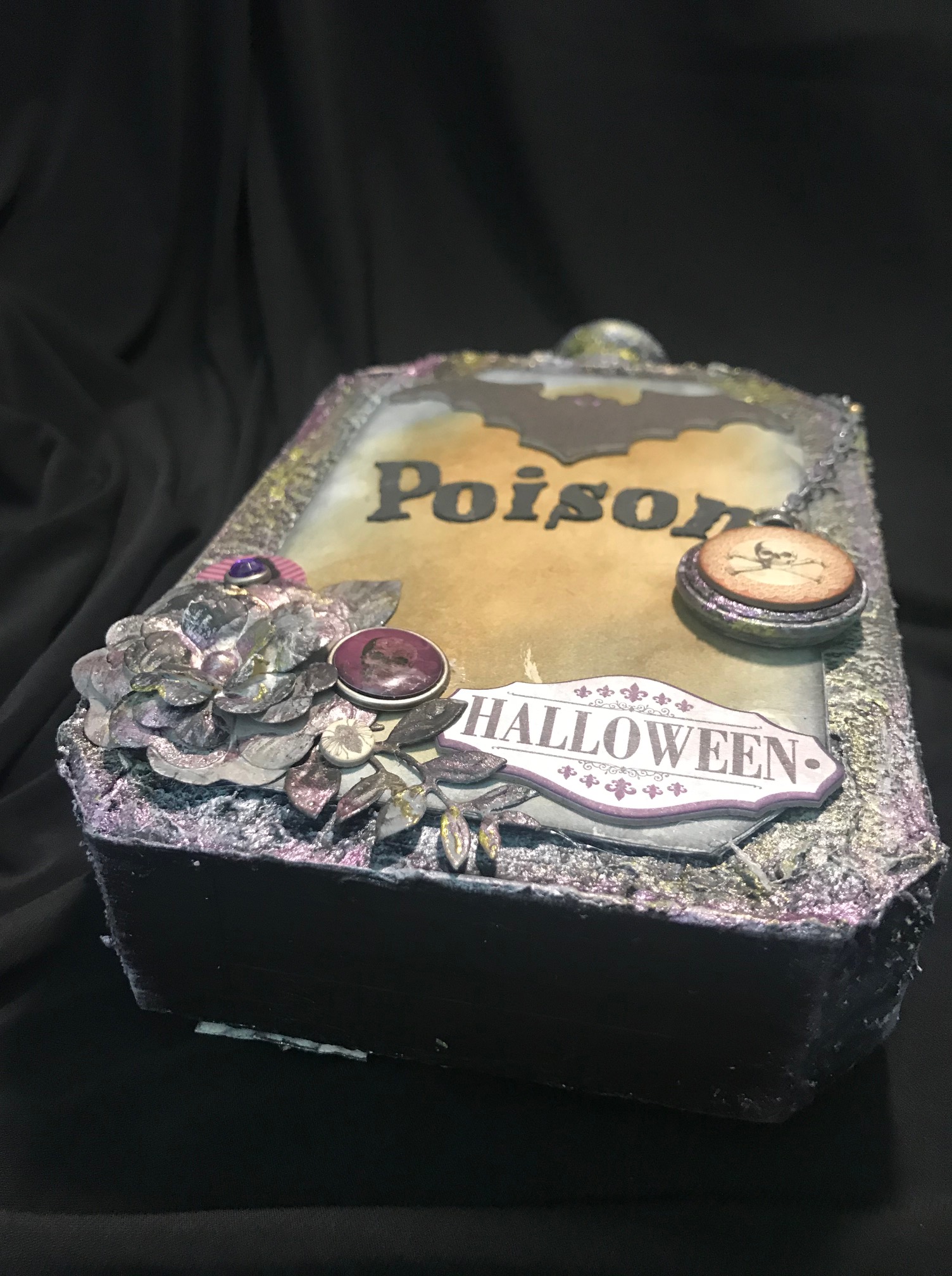
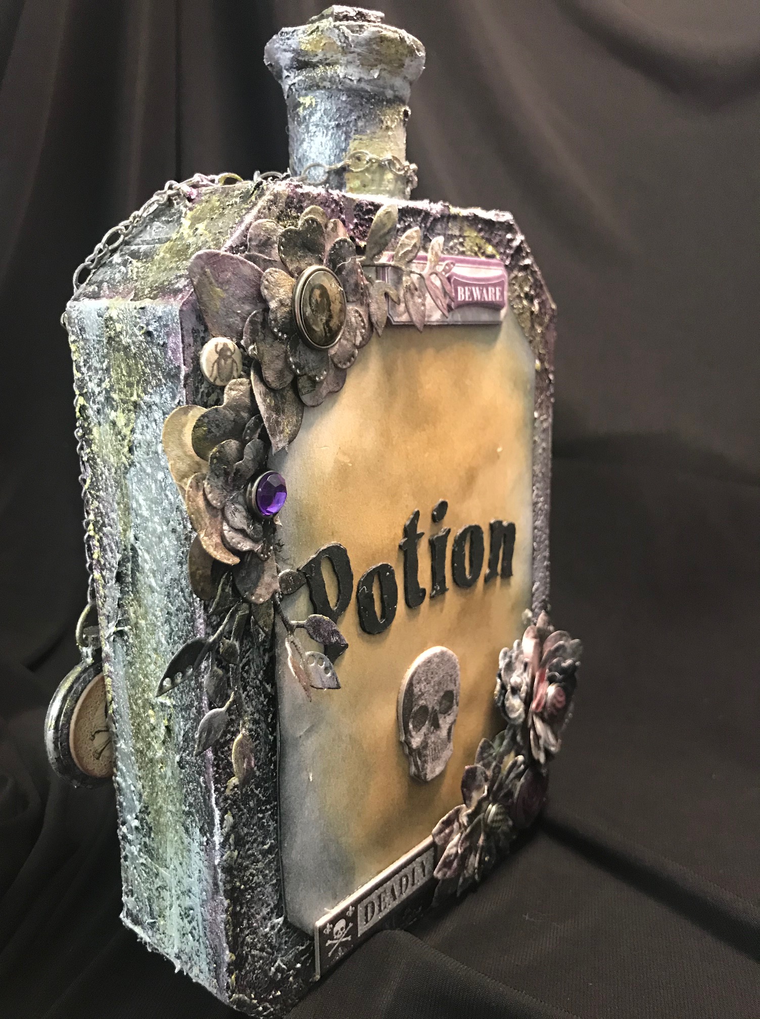
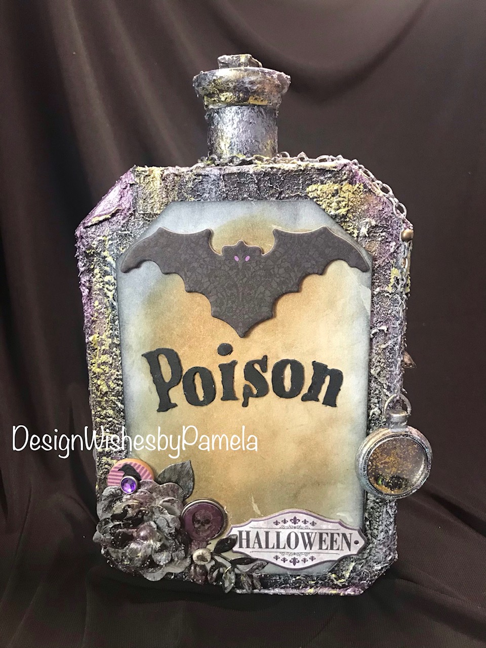
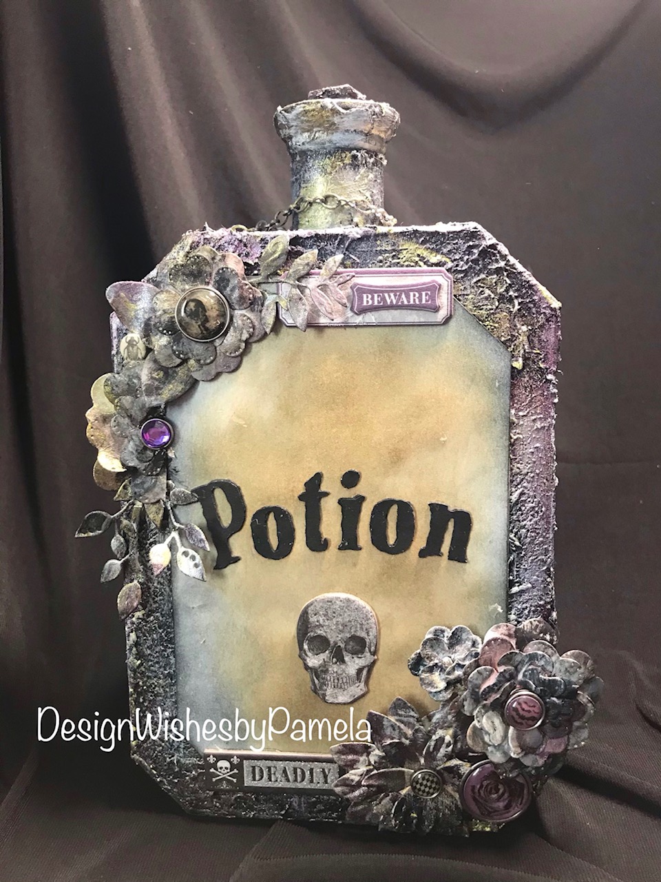
Today I am sharing two more pieces of Halloween decor. I previously shared a poison potion bottle I made for my “Reinventing A Project Series”.

I decided to design these new bottles to complete the set. Below are photos and a list of supplies I used to create them.

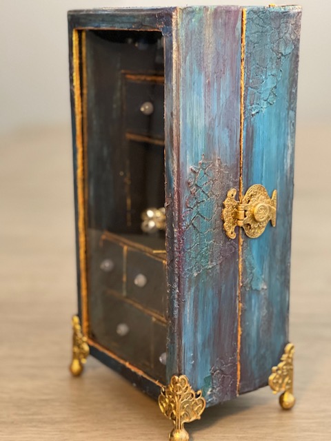
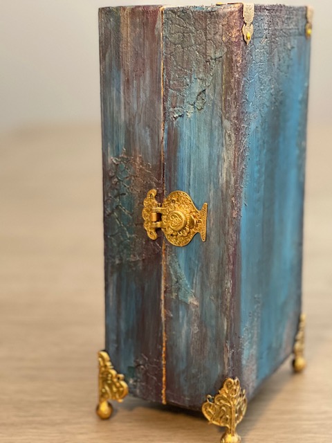
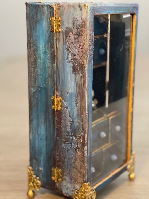
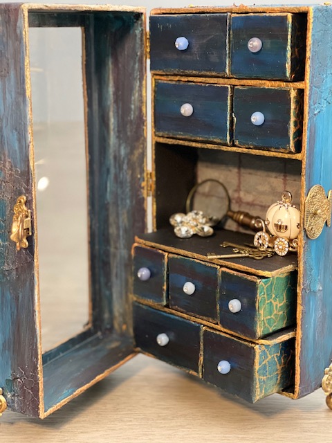
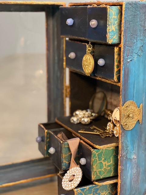
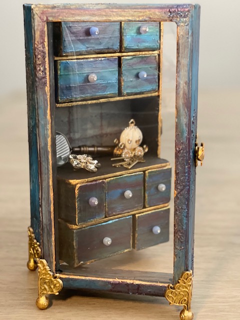
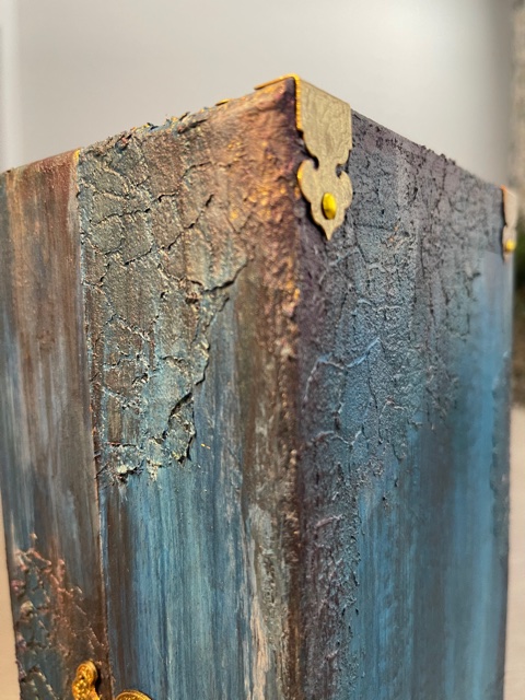
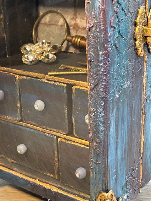
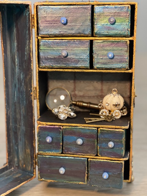
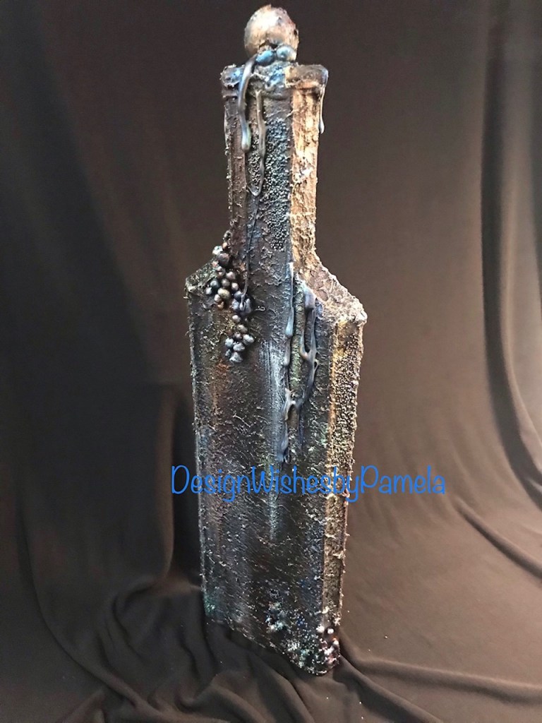
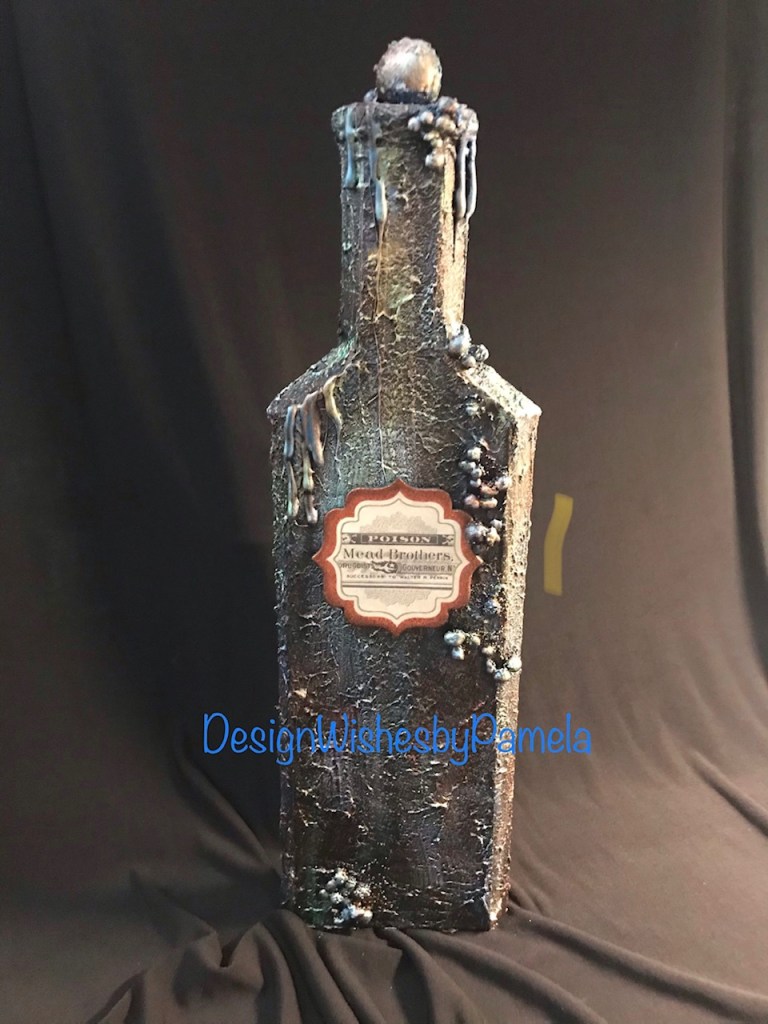
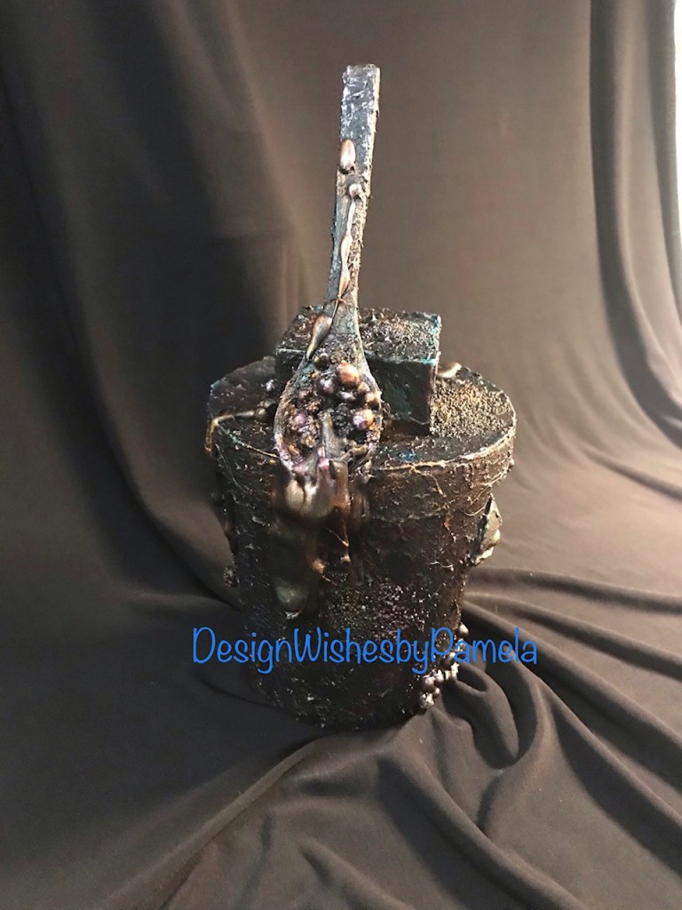
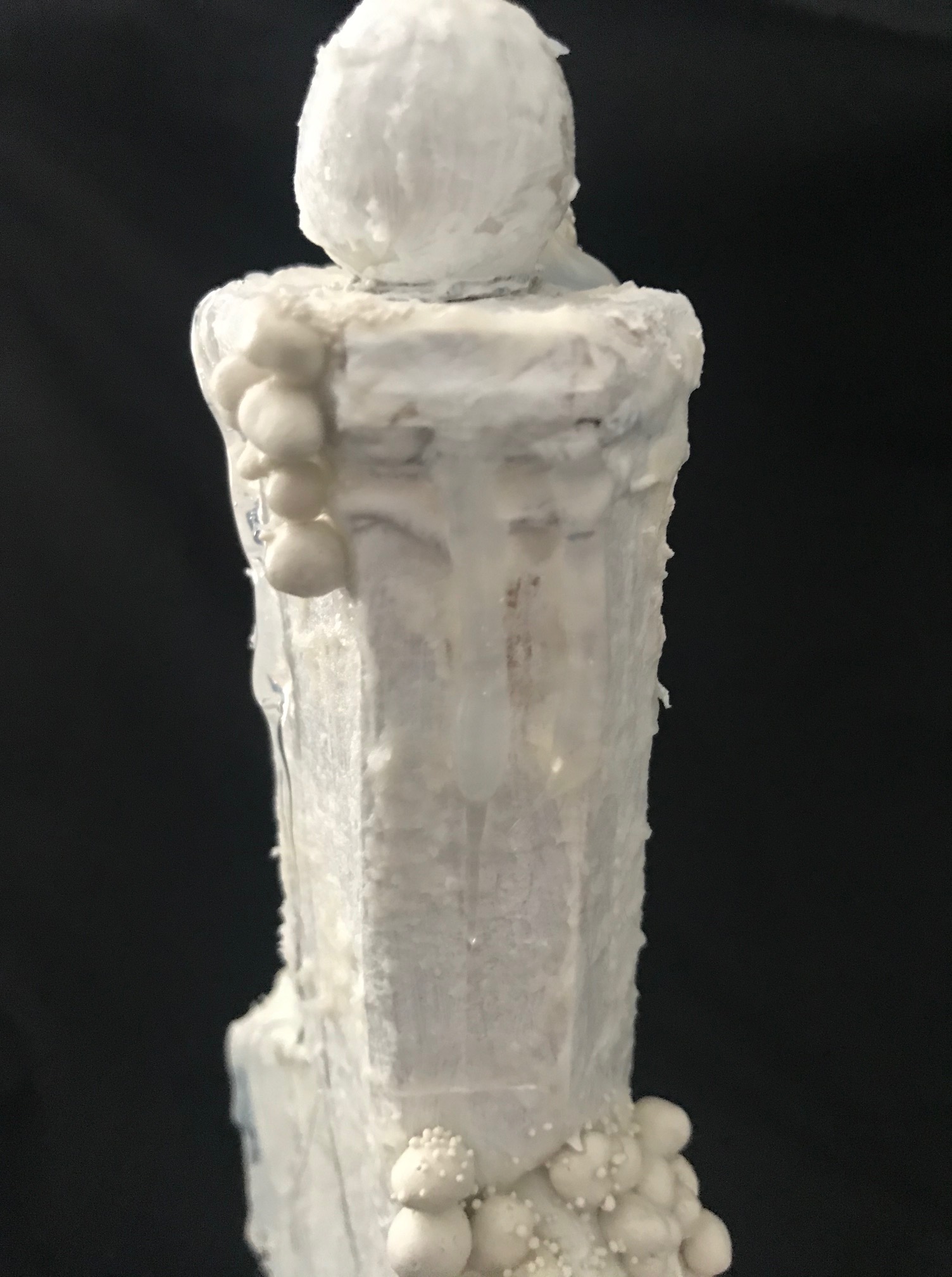
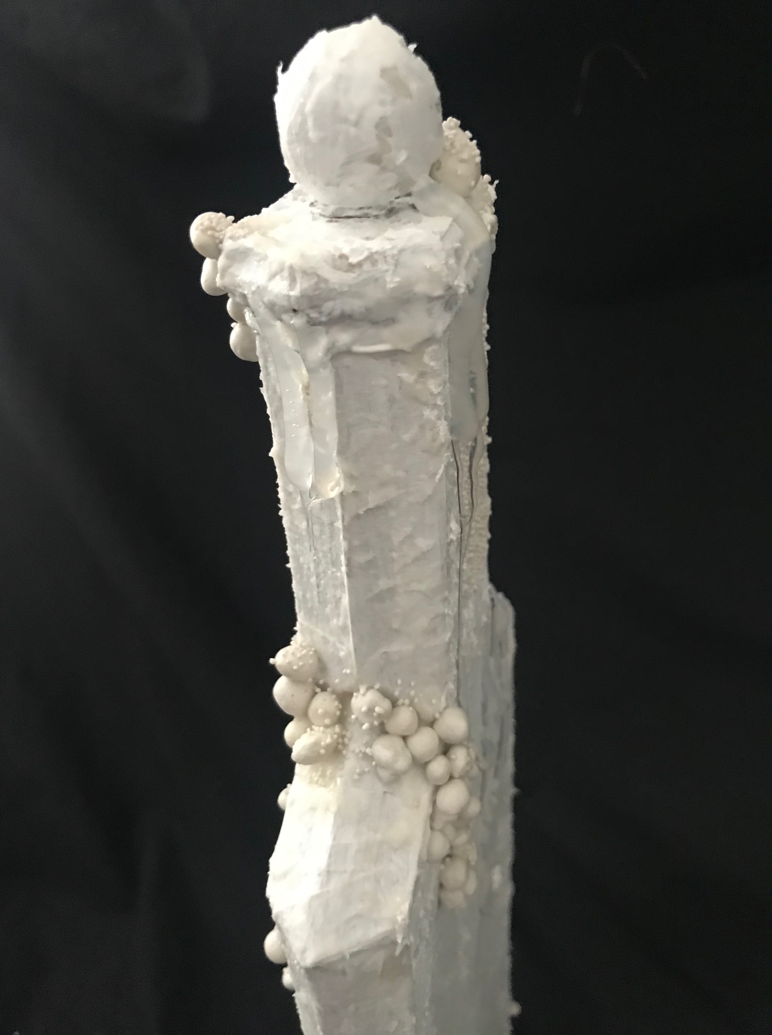
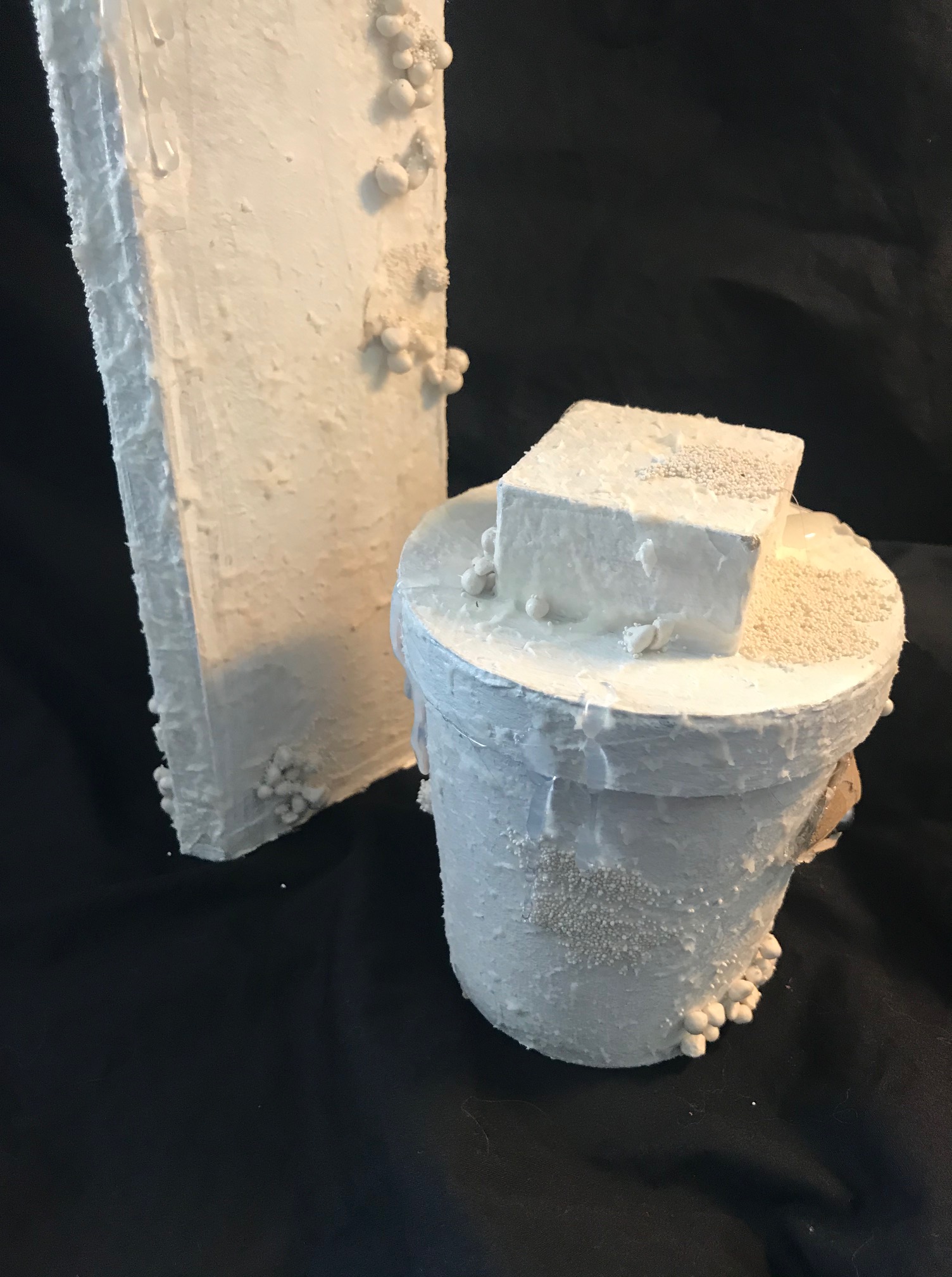
The tall bottle was created by using Graphix Medium Weight Chipboard, Art Stones (listed below), and a large bead from my jewelry making supplies. The smaller container based was created by using a treat cup (see list below), a small box lid, and a small wood spoon from a dollar store. I used the same process for prepping the chipboard that I shared on my YouTube channel earlier this month. An additional design element for the new bottles included the use of hot glue drips to create a dripping/dripped potion oozing from the bottles. I created the “eye” for the short bottle by cutting chipboard pieces for the outer part of the eye, then I added a small bead from my jewelry making supplies. I colored the inner eye with Indian Pink Wax Cire Cera and the eyeball with Sparks Fairy Wings, a dot of red and black acrylic paint.

NOTE: I did weight the tall bottle down by adding some small plant stones and glue before sealing up the bottle. Because the bottle design was tall and thin, I wanted to make sure that it would not tip over.

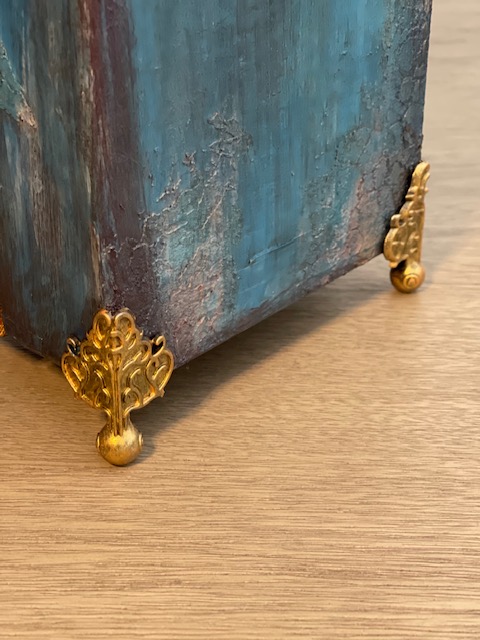
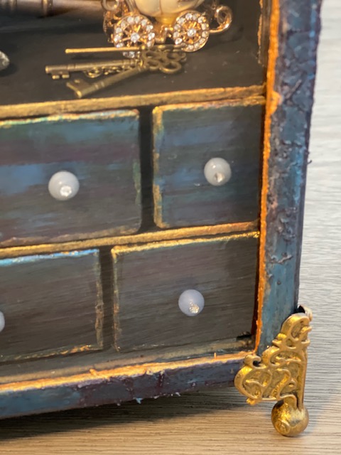
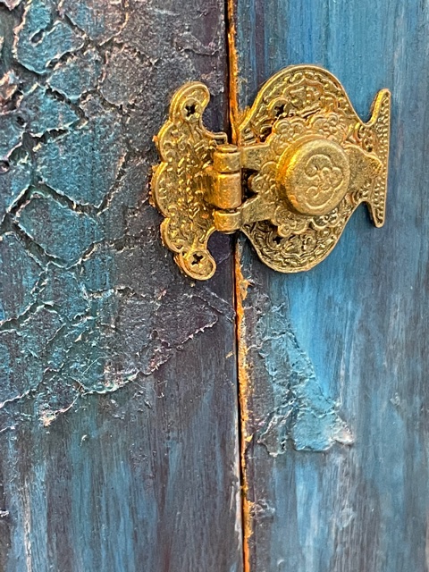
The color effects from the Prima Marketing/Finnabair/Art Alchemy products and the Tim Holtz’s Distress Ink, brought out the texture details in the design. I simply love the Firebird and Mint Sparkle Wax Cire Cera colors!

I hope you like these Halloween decor designs, and I hope they inspire you.

Thanks so much for following this post and blog.

Prima Marketing/Finnabair/Art Alchemy Metallique Wax Cire Cera: Bronze Age and Rich Copper

Prima Marketing/Finnabair/Art Alchemy Wax Cire Cera: Firebird, Indian Pink, Mint Sparkle

Craftsmart Satin Acrylic Paint: White

Prima Marketing/Finnabair/Art Alchemy Metallique Acrylic Paint: Emerald Green and Deep Waters

Prima Marketing/Finnabair/Art Alchemy Sparks Acrylic Paint: Iris Potion, Ginger Magic, and Fairy Wings

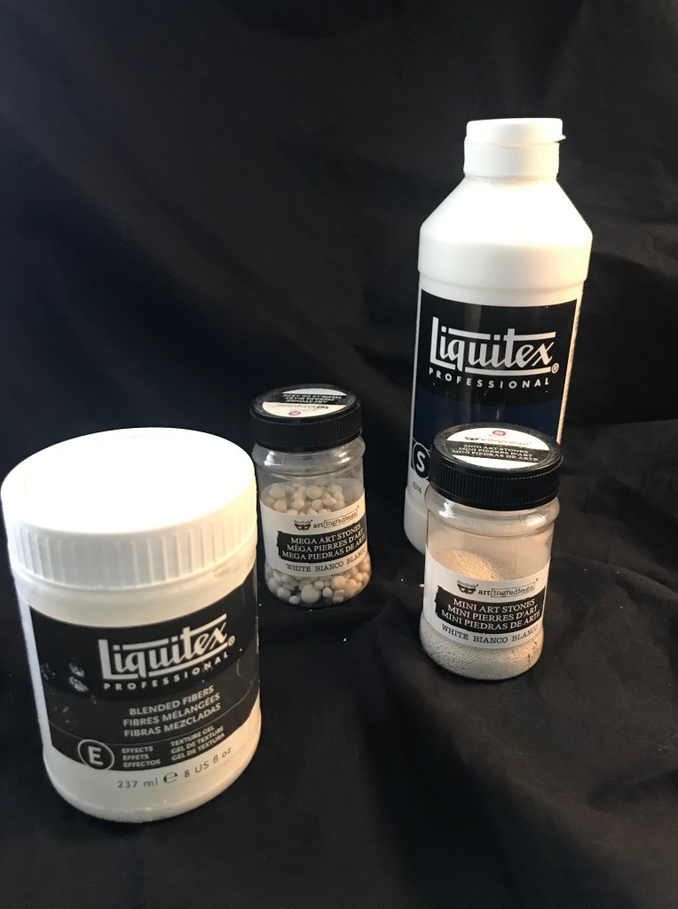
Prima Marketing/Finnabair/Art Alchemy Mini Art Stones: White

Prima Marketing/Finnabair/Art Alchemy Mega Art Stones: White

Ranger Ink/Tim Holtz Distress Ink: Black Soot

Michael’s Stores Celebrate It Treat Cup

My Minds Eye: ” Wicked Mechant Malvado” Chipboard Stickers

Liquitex Gesso

Liquitex Blended Fibers

Liquitex Mars Black Acrylic Paint


Reinventing A Project Series: Final Project

Thanks for following this series!

Today, I am sharing the final project for the series. I just had a few bits of flowers leftover from the original project, and decided to design something for Halloween.

If you are just viewing the series post, here is what the original project looked like. I took it completely a part (excluding the album), and created new project designs.

Here are the two previous projects I designed from using parts of the project above.

For this last project, I used chipboard to create the potion bottle. I also used a cardboard tube from a plastic bag roll, a wooden foot base from my mixed media supplies, and topped the bottle off with a stack of 1/2″ chipboard squares. The texture for the bottle was created using Liquitex Gesso and Blended Fibers Paste. The colors on the bottle was done with a layering of Liquitex Mars Black Acrylic Paint, Prima Marketing Inc/Finnabair/Art Alchemy Sparks Paint in Fairy Wings and Iris Potion along with Silver Spoon Metallique Acrylic Paint. I used a touch of White Satin Acrylic Paint from Craftsmart (purchased from Michael’s). The flowers were originally created by using the flower and leaves die from Graphic 45 Large Tag, ATC Tag & Flower Metal Dies set. I colored with a combination of Ranger Ink/Tim Holtz Distress Inks in Black Soot, Walnut Stain, Scattered Straw, and Vintage Photo. I also used Liquitex Gesso for base coating the flowers and the Mars Black Acrylic Paint. The chain was distressed with the same combination of paints and acrylics as mentioned before.

Additional accents for the bottle include chipboard and brad pieces from Recollections (Michael’s brand) and “Wicked Mechant Malvado” from My Mind’s Eye. I used a Mini Pocket Watch from Time Holtz Idea-olgy. For the Poison and Potion titles on the bottle, I used PN Goose Pimples font from Silhouette and cut the letters out on my Cameo 3 with Recollections black cardstock. I triple layered the letters to give a raised effect. I created the label bases by cutting cardstock in layering the cut pieces three times. I distressed the labels with Ranger Ink/Tim Holtz Distress Ink in Black Soot and Vintage Photo.

Here is a video showing the entire project process design.

I hope you enjoyed this series. Please follow me on social media, my blog, shop, and YouTube Channel. You can use this one link to access my posts. https://linktr.ee/designwishesbypamela

Thank you!